Phone: 330-388-2011
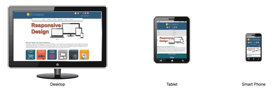
Responsive Design
- Mobile Design for Mobile Users
- Same Great Content and SEO Structure
- Bring Local Visitors to your Place of Business
Without a responsive design, mobile users will leave your site scratching their head. Responsive Web Sites are designed in such a way that they will look great across all devices. Content flows gracefully to fit the size of whatever device and screen width your visitor is using. This web site is responsive - try it out - shrink and expand the browser window to see it work.
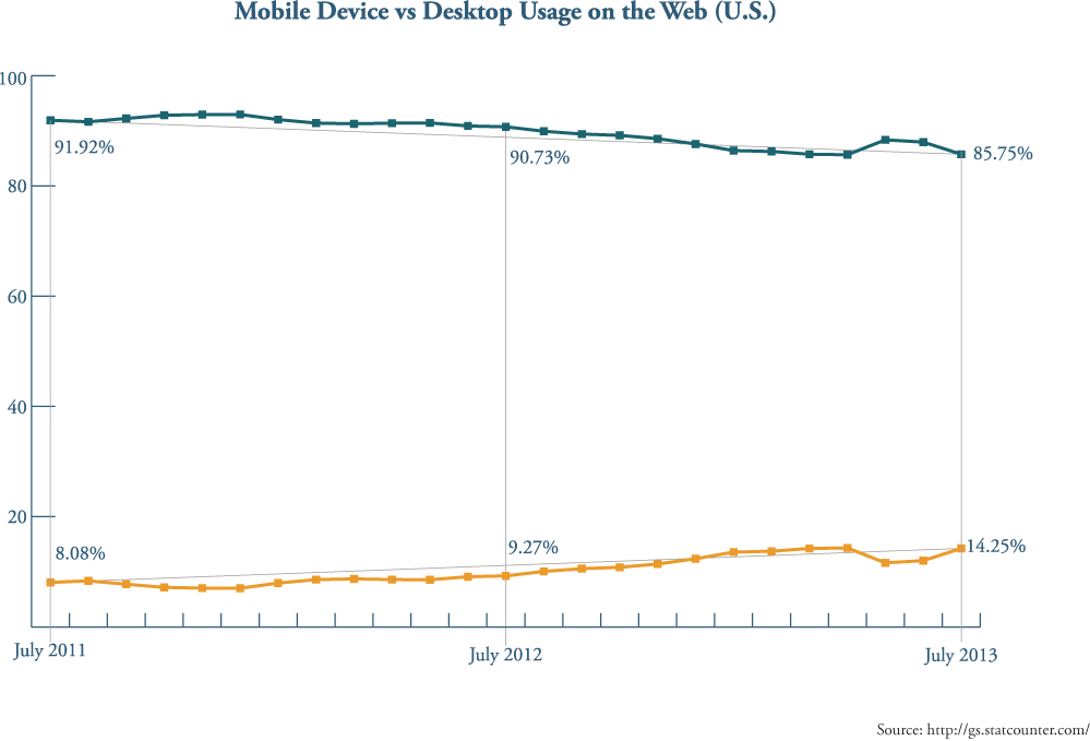
You may be thinking: "That's nice. So what?" Currently, mobile users (people who browse the internet with tablets or smart phones) account for more than 20% of web site traffic globally (14% in the U.S.) - and this number is growing daily. Looking at the statistics provided by StatCounter Global Stats (gs.statcounter.com), mobile usage has gone up about 65% in the past year (from 9.27% to 14.25% of total internet traffic). At this rate, mobile users will account for as much as 25% of total internet traffic. That is a number too large to ignore.
If mobile users are important to your business, disregarding mobile design is the same as ignoring customers.